
In my previous article, I finished by saying I would hopefully be able to continue our look back at 2015 by exploring some of the top weather stories from our part of the world. Between then and now, both NOAA and NASA released their 2015 global temperature data and I figured we should spend some time checking out their numbers, along with some of the great graphics that they’ve created, to show just what is going on. After looking at the graphics I started thinking about our long-term temperature anomalies and decided to plot what’s been happening in southern Manitoba since 1940. So this article will be a little shorter than usual, but with a lot more graphics. I’ll give a little bit of an explanation on some of the graphics, but will leave most of the interpretation to you, as you know what they say: a picture is worth a thousand words!
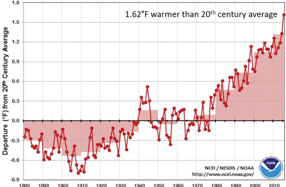
Looking at graphs produced by NOAA and NASA that show global temperature anomalies for 2015 and going back to 1880, two things jumped out at me. The first was that 10 of the 12 months of 2015 saw record global monthly temperatures. Second was the fact that only the North Atlantic and a small area near the southern tip of South America had below-average temperatures. Looking at the time series graph, you can really see how global temperatures have shown a steady increase since the 1980s.
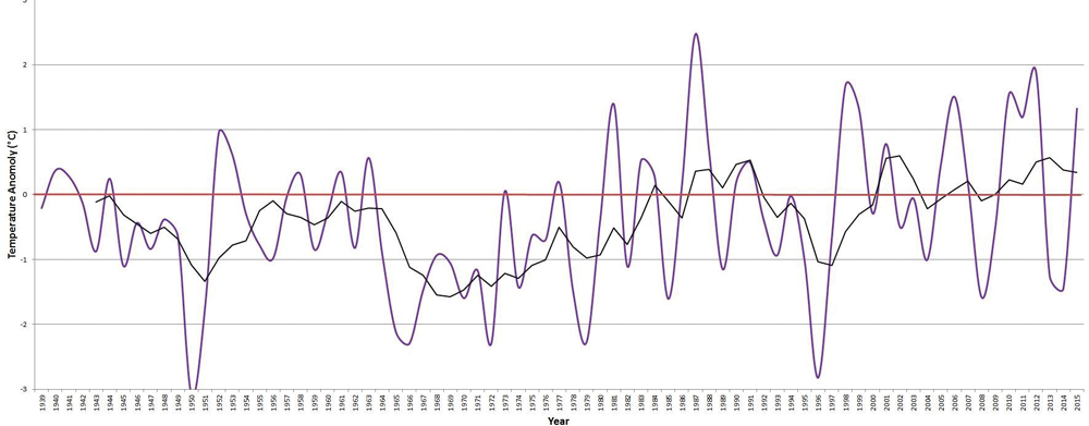
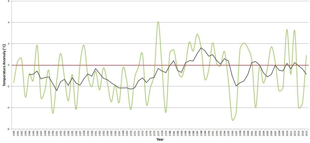
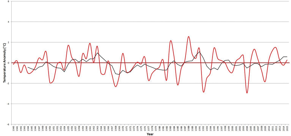
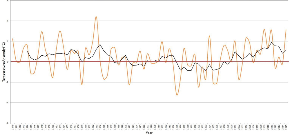
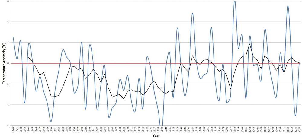
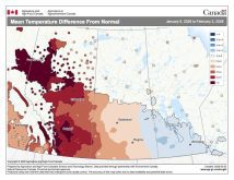
It was this plot that got me thinking about how our part of the world’s temperatures are comparing to the global trend. I’ve gone through my numbers a couple of times and I am pretty sure I haven’t made any glaring or stupid mistakes with the data. I used Winnipeg’s data simply because it was the easiest data set for me to work with, and when we look at monthly and yearly temperatures and temperature trends, there is very little difference between Winnipeg, Brandon and Dauphin. The graphs show the temperature anomalies, which is a fancy way of saying the difference between the actual temperature and the long-term average. The coloured line is the actual data, and the black line is a five-year running mean, which helps to show longer term trends in the data.
Read Also
How Earth evens out the energy input
Earth has surpluses of radiation in its equatorial regions, and deficits toward its poles. Our weather is a matter of Earth trying to even out the imbalance, Daniel Bezte writes.
What surprised me a little bit was that on an annual basis, while the trend in our data kind of mimics the global trend, we are not seeing the same magnitude of increase. This then made me want to see if there were significant differences between the seasons. Winter values were interesting, in that there have been very large swings in temperature from well-above-average winters to well below average, but since the 1980s there have been a lot more very warm winters. Fall temperatures have shown the greatest increase in average temperatures, with values now typically running from 1.0 to 1.5 C above average. Summer, on the other hand, has shown very little change, with no obvious trend in the data. Finally, spring showed a rapid increase in temperatures during the 1970s and 1980s but since then, the trend has cooled a bit and flattened.
Enjoy analyzing the graphics below. Next time we’ll look back at January and look ahead to see what the rest of winter and early spring might have in store for us.